With Interior photography it’s so very important to understand the objectives of a client. For example an architect will want their clients eyes to float around an entire space, to not be preoccupied with small details but to be immersed in the entirety of the design, the light the structure and its form. An interior or furniture designer on the other hand may be more interested in creating an environment of rich detail, with the eye naturally falling on key pieces or textiles within the space.
With a pallet of controls such as camera technique, styling, lighting, composition and retouching a photographer is responsible for transcribing their clients design philosophy. When an interior space has taken many months of careful planning and often hundreds of thousands of dollars to construct, this is by no means a small responsibility.
Boffi Kitchens
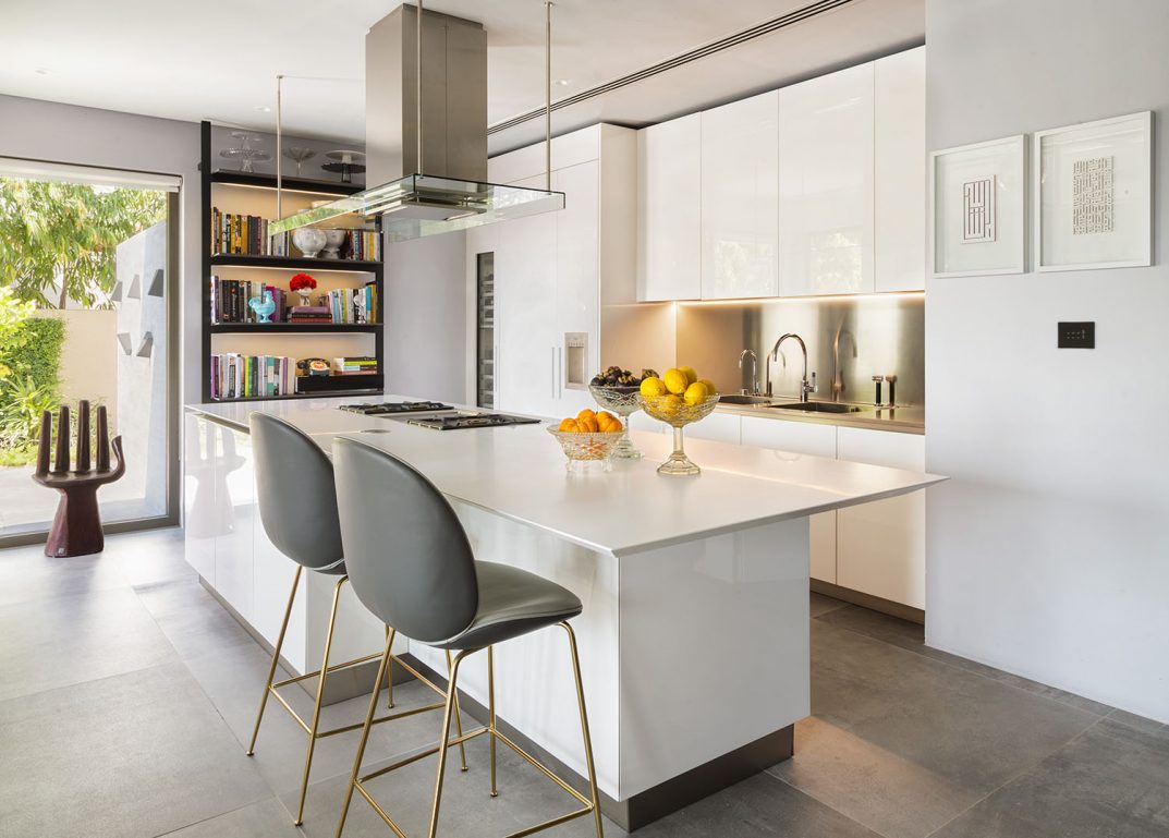
The photograph above was taken for Boffi Kitchens in Dubai. The kitchen had been photographed on a previous occasion by another photographer but the images were felt to be too dark. The space was lit mainly from the strong light coming in from the garden with weaker light falling on the left hand side of the room from windows in an adjacent room. As a result the shadow areas were far more pronounced than was acceptable. The client wanted a feeling of enveloping light, a brightly lit space which showed of the clean white lines of the kitchen.
When setting up the composition I wanted to make sure that there was no distraction away from the lines of the kitchen. The homeowner had provided a lovely bouquet of flowers but this would have become the hero of the shot. Instead I set up a simple collection of fruits in bowls on the counter as an element for the eye to fall. They added a simple pop of colour but not enough of a block of contrast to be a distraction. The sink area and bookcase were de cluttered again to avoid distacting attention away from the simple lines of the kitchen. Had this been an editorial shoot I would possibly have allowed more props but there were already enough interesting objects in the bookcase that the room felt ‘lived in’.
For me the counter chairs povided a challenge. There were originally three chairs which was too much. I considered reducing to one chair but this just looked a little odd. Instead I set my camera at a height where it was looking over the chairs and made sure that they didn’t fight with any other elements such as the stove top or the book case. Aligning them in any way other than flush to the counter would have brought more attention to the chairs.
Working with natural light
Whilst I brought lights with me to the shoot I chose to photograph the room with natural light. The challenge was to control the bright light coming into the room from the window which was causing flare in the camera. This was done by photographing the room with the blinds down, allowing the side light to become more prominent. The shadow areas on the right side of the counter were then ‘brought up’ with plates of different exposures. It was important to not over fill the shadows however because I wanted to retain a sense of direction to the light.
The chair in front of the window was also taken from a plate with the blinds down and then dropped in on top of the images taken of the garden. This allowed me to control the flare around the chair and preserve its color and tones.
The stainless steel sink back was reflecting a lot of light from the window so exposures were made to bring these tones down and carefully blend into the photograph.
When photographing a space such as this, its always a really good idea to photograph the room with the lights on and off. This allows you to control the lighting scheme in post production by isolating and controlling the intensity of individual lights. I wanted to see the warm light in the sink and on the floor but these lights added too much warmth into the the counter top so this was controlled in the editing.
Conclusion
The age of digital has allowed photographers to exert a great deal of control over our images and this is especially true with Interior photography. There is however no substitute for planning and photographing all the elements in camera that we need to bring together for the final composition. If you know you need to photoshop something then plan for it by photographing plates. When Ansel Adams talked about previsulation, his words are no less relavent today than they were in the days of film, we just now have a great deal more brushes available in the toolbox.
On a final note, I think the most important part of producing an image like this is to stand back, to look at the photograph and ask yourself if the image looks natural. It’s all to easy with Interior photography to get a little carried away but it’s not the role of a photographer to impress people as to how cleaver we are, or how much work has gone into the image. The hero of the image is the space itself and it’s design. If my client thinks I just simply ‘clicked’ the image then i’m ok with that becaus it means I have succeeded.


