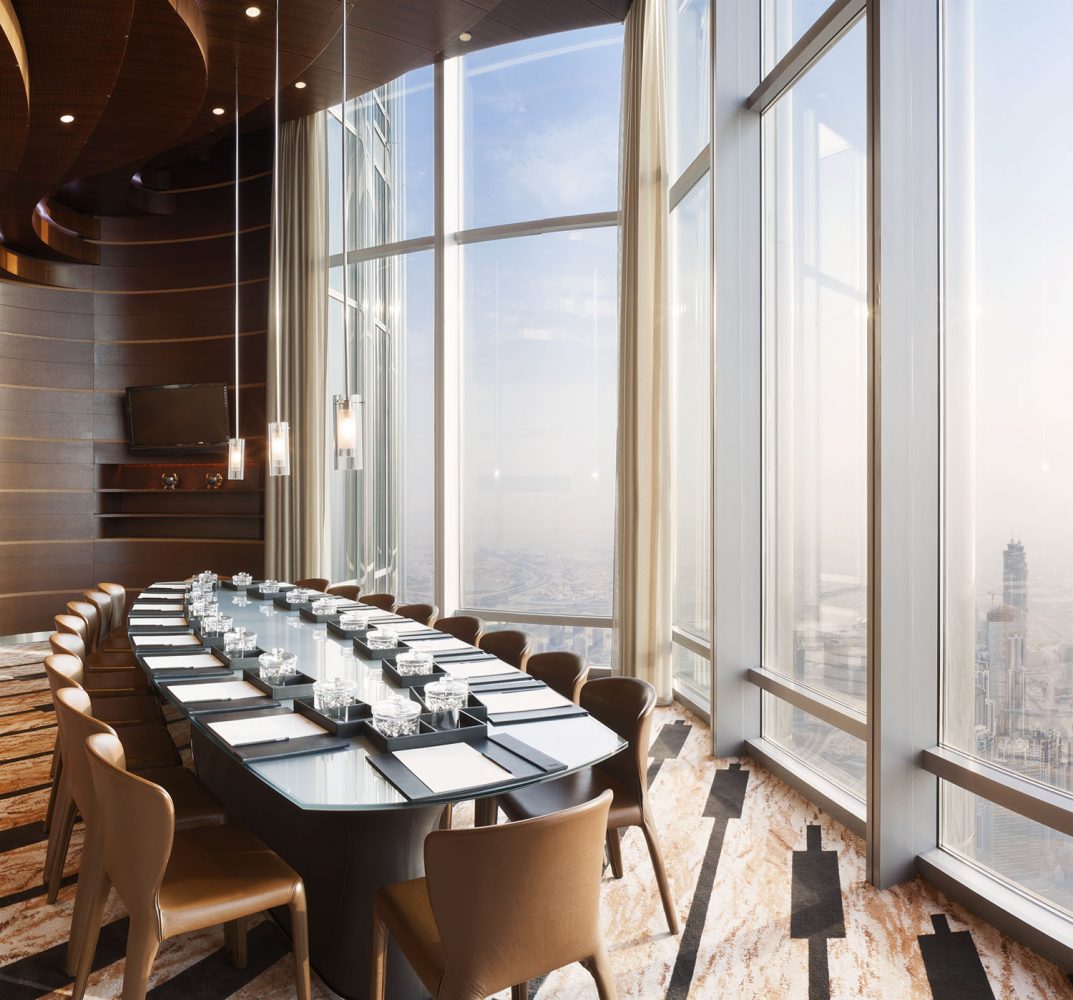
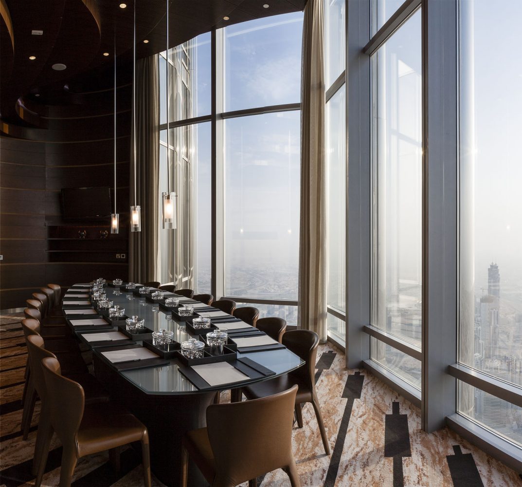
In this post I will walk through the process of editing interior photography by looking at the workflow of a fairly simple photograph and the process of bringing together the final image to a stage where it can be delivered to a client for publication. To download a low resolution photoshop file for the image used in this tutorial click here.
Interior Photography
One of the roles of a photographer is actually to make things look really easy and this is especially true in interior photography. It doesn’t matter how much trouble you went through to produce a photograph, the image must look natural, its not a showcase to prove how clever you are. That can of course be a little frustrating but I actually get a kick out of people thinking that I just ‘snapped’ a shot because it means that I’m doing my job right. The last thing you want to hear is that it looks really ‘photoshopped’. The challenge comes because the camera doesn’t see in the same way as the human eye. Anybody who has ever photographed somebody standing in front of a brightly lit window will understand what I mean. The camera has a vastly reduced dynamic range and this is a real problem when we want to translate the experience of actually standing in the room onto a page of a magazine. I have picked quite a simple image to demonstrate the process, it was shot entirely with natural light, but I will deal with situations of mixed lighting in future examples. I am also assuming a working knowledge of photoshop.
The room was actually extremely small so the image was shot by stitching together two separate angles of images shot with a 24mm lens in portrait format. The reason for this was that I would have had to shoot with a very wide lens and I didn’t want to bring in that super wide look and distortions into the image. The weather outside was quite dusty so I wanted the full window height to make use of that small pop of colour that existed in the sky as well as retaining the detail in the moulded woodwork of the ceiling. Stitching the images gave me much more control as well as effectively increasing the resolution. I’m not going to talk about the stitching process, thats for a later blog but I pre stitched all the individual exposure layers using AutoPano Giga. So lets dive in and have a look at the raw exposures.
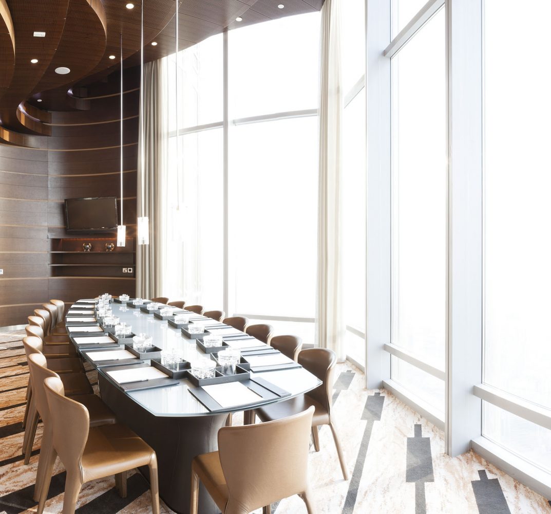
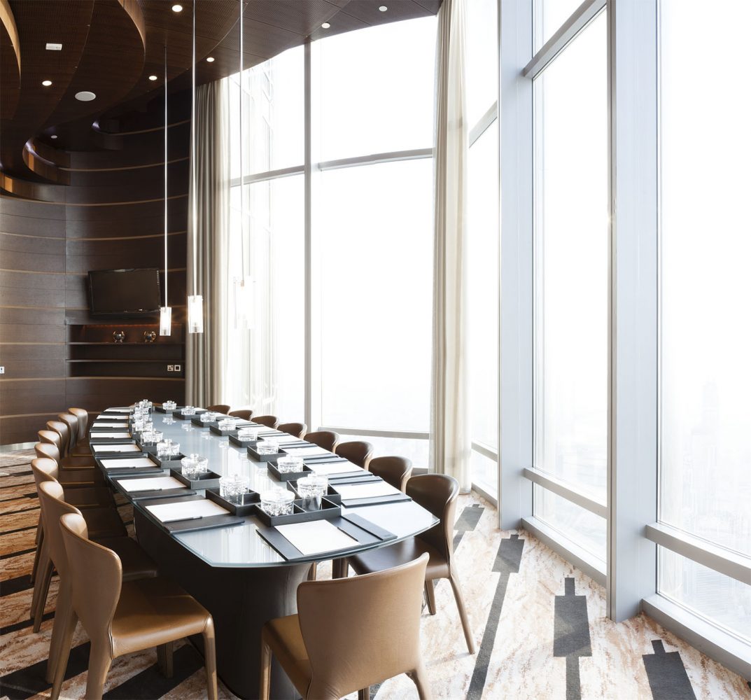
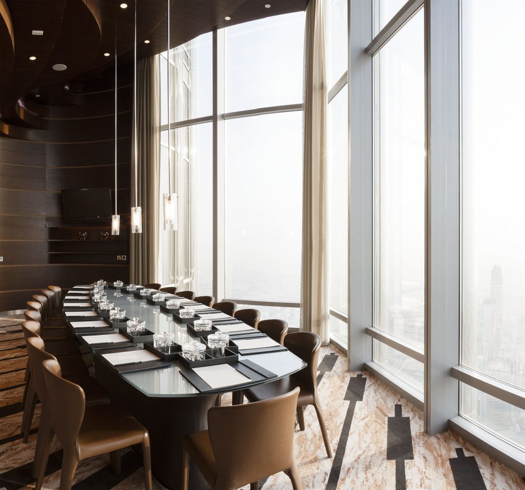
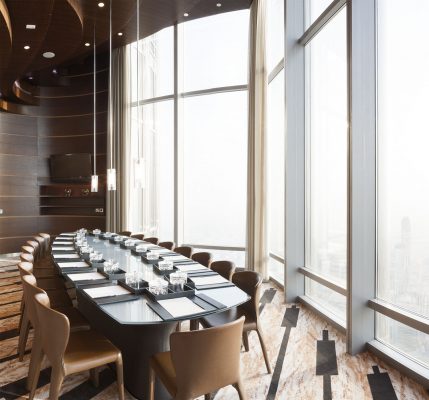
The image was composed of four separate exposures. These images before stitching were exported from lightroom with a few tweaks but essentially they are pretty much raw images from the camera.
Exposure Blending
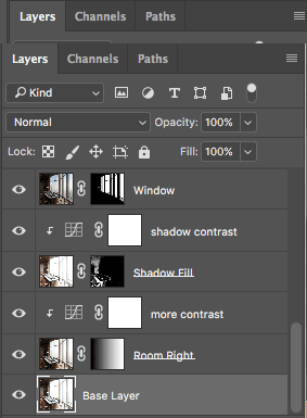
Click on the base layer above, this forms my background layer in photoshop. This exposure gives me good tones throughout the room. The shadows are not too bad but could use a little more detail. The window is obviously blown out and the right side of the room too bright in the carpet and the window frames.
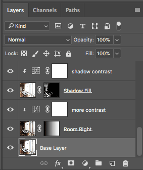
The first step is to bring in a layer to fill in the shadows. I do this using the colour range to create a mask revealing the shadow tones. This actually has the effect of adding in shadow detail but it actually also makes the shadows quite flat so to compensate I add a curves layer to add a little more overall contrast by darkening them slightly.
This is probably not the best image to illustrate this as the shadows are already reasonably well exposed but the advantage of using a shadow fill layer rather doing it with just curves is I’m adding in detail and then remapping the tones, I benefit from reduced shadow noise and tones that are more detailed, natural and less forced.
My next step is to address the right hand side of the room. To do this I use my ‘Room Right’ layer and add a simple gradient mask revealing the right hand side of the room. I need to place this layer below my ‘Shadow Fill’ layer because I don’t want to undo all the work that this layer is doing. I like the look of the middle tones I get from my ‘Room Right’ layer especially around the window frame but the black detail in the carpet and shadows could do with a bit more contrast so I use a curves layer to take my black tones down a little.
Lets have a look at the image so far. To me the interior looks pretty good. It needs a bit of tweaking here and there but generally we are already pretty close. This is how my layers look so far:
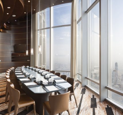
So now to add the window exterior and this is where it can get a little time consuming. Blown out windows are a constant problem in interior photography so getting this right is really important. I will generally start of by creating a mask layer and then use the colour range to mask out everything but the high tones. Use the range sliders and the fuzziness slider to get as close as possible to the look you want. The real problem is your middle tones where they blend with the bright window areas and you are going to need to get a little dirty with the paint brush to clean up the mask layer. This image contains a lot of straight lines and very little in the way of net curtains so its easy to clean up the mask. There are a lot of tools to help you with this but thats an tangent that could make this post really long.
On images with net curtains previously I have created an HDR image specifically for the tricky tones and used this to help me blend the two layers. That’s really out of the scope of this tutorial but if you would like me to work through some examples then let me know in the comments section below.
Ok so the window is masked. I like to play around with the opacity slider for this layer to figure out how much blending of the window I want. Personally I’m not a big fan of windows that are obviously burnt in to such an extent that it looks almost like something out of a 60’s Star Trek set. To me an exterior should look pretty high key, especially if the sun is shining outside. Its all personal taste though so play around and see what works for you.
That pretty much wraps up the exposure blending for this image. Its at this stage that I could consider more adjustments to play with the overall exposure such as creating localised pools of light or shadow etc but i’m happy with the image so far so lets going to go straight on to the grading process.
Image Grading
Exposure blending gives us a full range image to work with. Its through the grading process that we bring the image to life and make it pop. I’m not going to go in to too much detail with this because it really is very dependant on your own creative process as well as the target audience for the image. You might be producing the image for a client that requires very colourful images which will affect your choices in colour balance or saturation levels. With this image, as with most of my interior photography i’m looking for a very natural look so this is going to be quite restrained, but never the less will briefly run you through the process.
I usually find that the process of exposure blending and squeezing all those extra stops of dynamic range can make areas of the image feel quite flat so invariably I look to bring a little of that lost contrast and saturation back into the image. With this image I added in a little overall contrast using a curve layer and gave a bit more saturation into the warm tones as well as a little more into the blue sky. I usually play with a few localised adjustments and one such area was the exterior glass of the building where I added a little more contrast and adjusted the colour balance to a slightly more bluish tone.
The outside was very dusty on that day and I added a very soft warming filter graduated from the window to exaggerate the feel of the light from the outside. The client had no interest in faking the exterior and I quite liked the contrast of the boardroom looking out over the city under construction.
My last adjustment was just popping a little more contrast into the woodwork and lifting it a little on the back of the room. This I did with a curve layer and masked the wood tones via a simple colour selection.
Clean Up
When the grading work is finished its time to think about cleaning up the image. Removing all the light switches, cables and anything else the client finds obtrusive. I usually just make a flattened copy of all the layers and label it so I know that this is just a cosmetic clean up of my layers below. When this has been complete the last step is to apply your output sharpening. I always think less is more when it comes to sharpening, its way too easy to go over the top and ruin the image so always make sure you do this on a duplicated layer unless you know you will never be asked for an unsharpened version.
Delivering Images
I find its counter productive to ask about the target medium for the image as it’s really the job of a graphic designer to match the image to certain paper types or perform a CMYK conversion. Choose a nice wide colour space like Adobe RGB if you are uncertain and deliver 8bit images. More and more I find my clients prefer to have images delivered as jpeg’s as they now usually get delivered over the internet but I always store them in my archive as 16 bit tiff files which can be produced if requested.
Well I hope this article was useful, its the first main technical blog I have written so let me know if you have any questions or requests and I will get on and write some more. If you are interested my portfolio of interior photography, this can be found here
